
We were torn. Some of our clients were torn. We explored several ideas that kept the old dog, or a version of the dog, by putting the image onto a shopping bag (remember the “Shopper” part of this new identity). They had a nice look, but, combined with the shopping bag, they all tended to subtly (or maybe not so subtly) suggest that we were a purveyor of dog toys. Or in the business of dog grooming. Which we decidedly are not.

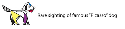
But it was hard saying farewell to the dog. Do you really want to turn your back on an old friend? But then we hit on a possibility of keeping a hint of canine. (And we do mean a hint).

See it? See the tail wagging? Now we just needed to get the dog presence and the Shopper presence all playing happily together with the type. We picked up the idea of the shopping bag from the “doggy boutique” idea, and replaced the dog with the wagging tail icon. We then started the color studies.

The beauty of having several people work on a project is that you get a whole bunch of ideas - and those ideas spark others (it’s not really stealing when you own the company). For instance, one of the designers had hand-drawn a logotype early on in the process. It had a certain appeal, but some people saw it as old fashioned (and the “w” in particular set off some Freudian anxiety in some) so we sent it back to the drawing board where it emerged much jauntier (and with no more anxieties).

So we’ve done the color studies (dozens and dozens), worked on the dog (or at least the tail of the dog–and no, not the hair of the dog), written taglines to neatly sum up what we do, and now we finally join the computer drawn type with the image and tagline and here we are:

Then it’s redesign the website and the Facebook page, redesign the business cards, letterhead, mailing labels, CD labels and all the rest. We’re getting there. Welcome to the new world of WAG. Design Powered by Shopper Insights. And yes, we can explain it. just call us.
Jim Walcott-Ayers
WAG Partner
No comments:
Post a Comment